


Can you tell us a bit about where you live and the work you do?
I grew up in western Queensland, Australia, on a cattle station, but now I live in Brisbane, the capital city of Queensland. It is a subtropical city, “beautiful one day, underwater the next,” where the flowers come out in force in autumn, and ibises and bush turkeys steal food from café tables.
I work as a book illustrator, a writer, and a university tutor (I’ve been a lawyer and a translator, too).
What appeals to you about fairy tales and fantasy etc?
On one level, I love the little jewelled worlds of fairy tales and fantasy: keyholes into secret gardens, in which you could be lost entirely. On another level, it’s their versatility that appeals to me, the way you can use them as a framework or a shorthand for so many projects, and the way they can function as a lens which alters your view of the world.
How did you get into paper-cutting? Was Hans Christian Andersen an influence at all?
I think my interest in cutting things out came from a more traditional craft basis. We were fairly remote and had to make our own amusements, my parents were interested in self-sufficiency, and my American mother had brought some of her childhood books to the Australian bush. I remember a book of “Pennsylvania Dutch Crafts”, which had cut-paper ornaments in it, and also my father making lampshades by hammering holes into tin.
Then at some point we acquired a book of fairytales illustrated by Arthur Rackham, which was where I first remember seeing silhouettes as illustrations. I think it was the Rackham Cinderella.
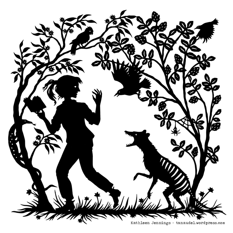
I’d played around with paper-cutting a little, then, but a few years ago there was a local group art exhibition on the theme of fairy tales, and as I developed my ideas for that I decided to do a series of fairy-tale-ish images: girls with swords running with candles through tangles of roses, boys and dogs leaping through briars, starry godmothers with attendant foxes. That’s really where my current style (and preoccupations!) got started. I then illustrated Angela Slatter’s Black-Winged Angels a collection of retold fairy tales, and from there they started getting out into the world! I’ve done a few covers for Tor.com novellas, and the covers for the first two seasons of episodes of Serial Boxe’s Tremontaine, which pushed me to explore more the thematic and sequential possibilities.
But it’s so very pleasing to sit down and cut out a gleeful escape of foxes, or a languid mermaid, and just concentrate on the toss of a head or the curve of a fin.
How does it compare to your illustration and other work?
The silhouettes are concentrated essence of illustration. They force you to reduce the imagery to starkly communicative elements on a flat surface (a metaphor, perhaps, for the function of the basic skeletons of fairy tales themselves). But within and from those restrictions you can do and imagine so much: the implication of movement and light, colour and depth, hints with which the viewer can spin their own details.
The paper cutting keeps me from getting too precious with other techniques, and helps me concentrate on composition and communication, while also teaching me to appreciate those extra possibilities that other techniques offer.
How do you decide which technique to use on a project — paper cuts, pen and ink, etc? Does the subject matter help dictate which you use?
Frequently when I’m commissioned to illustrate a piece, my client has an idea of which style they’d like me to use — and how the picture will be used, and on what, can influence that choice, too. Sometimes I’ll just be in a pen and ink mindset, and all stories shift in my mind to suit that. On the other hand, on my own projects, I’ll sometimes start with the technique I want to use, and then I grow the story out of that. Different techniques resonate differently with the subject matter — not a wrong fit, just various.
Can you tell us about one or two of your favorite projects?
I don’t like to play favourites! I love them all. Hmm… probably the ones where a special printing technique has been sprung on me unexpectedly. For example, gold foil on the hardcovers (hidden under the dust jackets!) of Angela Slatter’s Bitterwood Bible and Holly Black’s The Cruel Prince — and while I didn’t get to design the outer covers for The Cruel Prince and The Wicked King, I did get the opportunity to do sequential maps: so much opportunity for fun and little jokes and ornaments and characters running around the landscape.
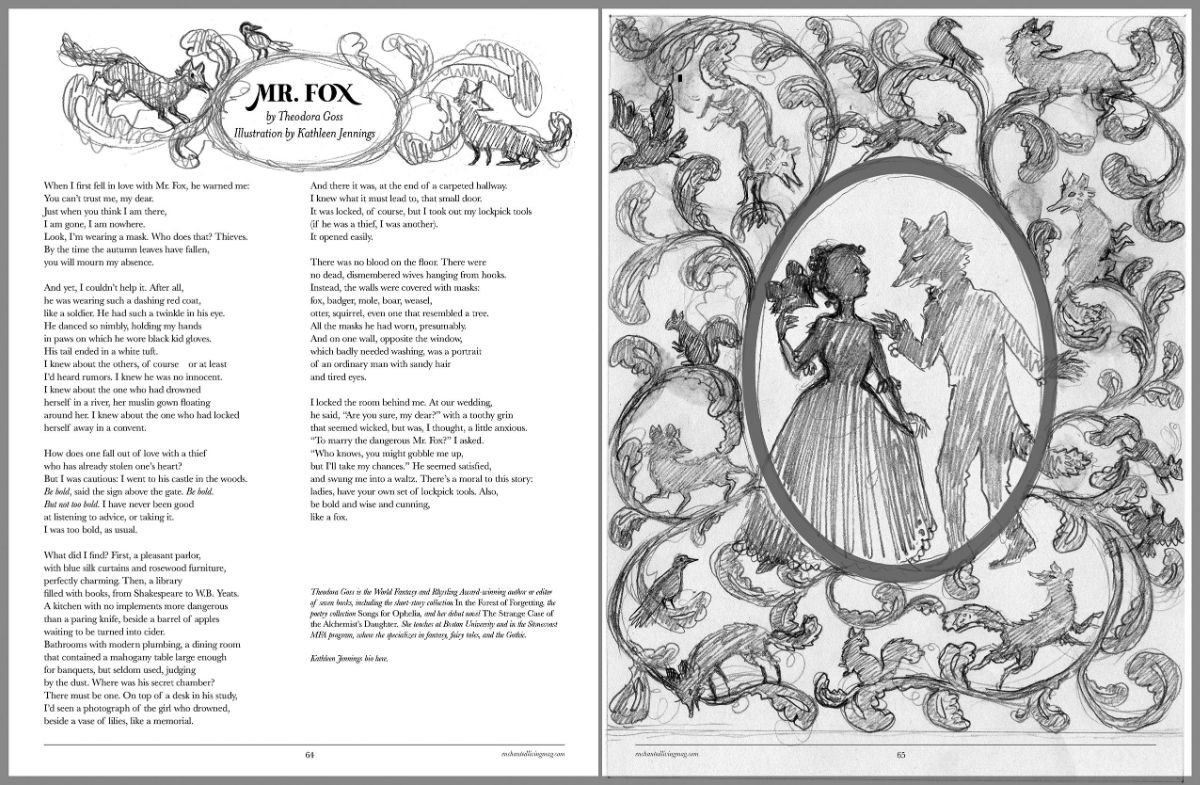
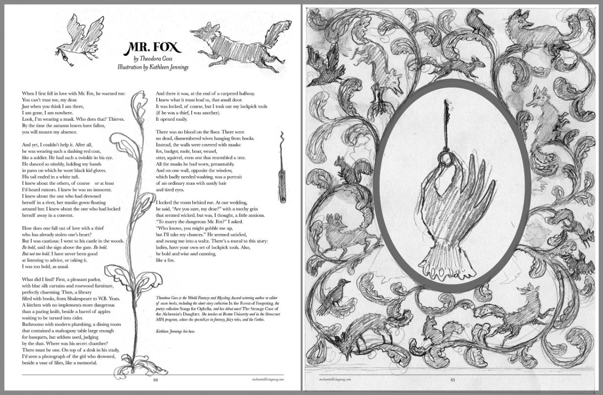
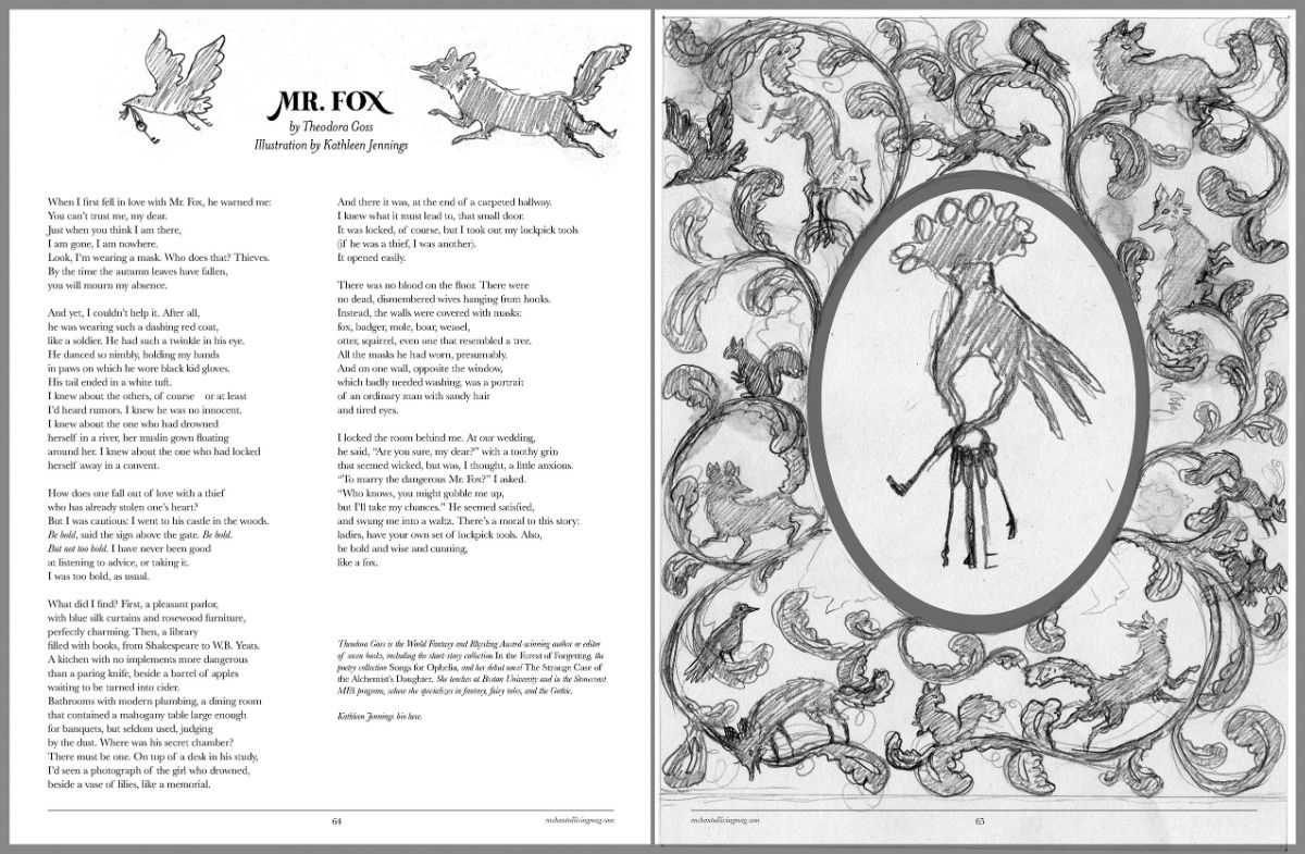
How did you go about illustrating Theodora Goss’s poem in our spring issue?
I’m very fond of tales of Mr Fox, and his ilk, and of Theodora’s work, so I was delighted to be asked to illustrate her poem. I began by printing off the poem and reading through it, underlining specific images and descriptions, and noting themes. Then I started sketching poses and elements all around the margins: foxes, mostly, and a few designs for keys, and dancing poses, and masks… From these, I put together a series of thumbnail sketches of possible layouts: borders? incidental illustrations? frames?
When the magazine confirmed their preferred approach, they sent me a mocked-up layout so that I could sketch around it. I worked up the image in more detail, refining the design for final approval. With that in hand, I traced the broad outlines onto the back of a sheet of black paper. I often like to do this sketch freehand, refining as I cut, but sometimes a picture needs to fit margins more precisely than that permits!
I then cut the image out with a fine craft knife, pushing angles and curls a little further, but enjoying the unexpected roughnesses and attitudes that appear at this stage. I almost always make the silhouette a single piece (an exception to this is my cover for The Border Keeper by Kerstin Hall, which was in three pieces).
From there, it’s just a matter of scanning in the final piece of art and cleaning it up as a digital file for printing. This is a necessary stage, and I like being able to make slight adjustments and add colour. It would be possible to do a whole design digitally, but that lacks so many of the happy accidents of a physical artwork. I don’t find working purely on the computer as soothing, personally, either… and it is so lovely to have a paper silhouette to hold up to the light, and cast shifting shadows on the wall.
We sent the Theadora Goss’s poem to Kathleen, along with a mock lay-out from art director Lisa Gill, and Kathleen sent us these three options which were all so beautiful we asked if we could share them all here! I mean really:
 Anyway, we can’t wait for you to see the whole illustrated poem in the new issue!
You just completed a dissertation on Australian Gothic literature. Please tell us more!
Yes! I just completed an MPhil. That’s a Master of Philosophy, a research degree — sort of a half-sized PhD. It was in Creative Writing and was practice led, so the main piece of writing was an Australian Gothic novella called “Flyaway.”
Then I wrote a dissertation on “The Visual Evocation of the Beautiful Sublime in Australian Gothic Literature.” It explored what I was trying to do in the novella, and traced the history of a beautiful Gothic (and beautiful sublime) in Australian Gothic literature.
In particular, I wanted to see how three key books managed to create and maintain this effect. I concentrated on Joan Lindsay’s gorgeous short novel Picnic at Hanging Rock, Rosalie Ham’s more recent and beautifully textural The Dressmaker, and several of Shaun Tan’s Gothic-ish illustrated stories in Tales from Outer Suburbia. Something they all had in common was using not only the trappings and motifs of fairy tales (which are, after all, so closely related to Gothic fiction), but their structures and engines.
This was gratifying to discover, given my interests — and my novella borrows several of those fairy-tale shapes, especially that of “Seven Ravens,” which I’ve loved for a long time, and have used as the bones of other stories.
And of course I managed to slip some illustrations (cut-paper!) into the novella and the dissertation.
And finally, how do you stay enchanted?
Get lost in fairy tales. Stare out train windows at trees. Honour texture and surface, as well as hearts. Look for the shapes of enchantment everywhere.
Her papercuts are so classic and I’m so excited to see the completed ones for the new issue!